Product Photography: Reality Seen Through Rose-Tinted Glasses
Have you ever looked at a magazine cover, see the model on it and think: “Wow she’s perfect.”
With that flawless skin, no blemishes, eyes sparkling and radiant smile glowing?
Most of us all know that no one actually looks like that, we humans (and maybe some cyborgs that are reading this with us) are organic.
We are constantly changing and are affected by the world we live in. Organic things are not perfect, it’s inherent of all growing things and that’s great. It’s what makes things alive, what makes them real!
However popular media such as magazines need to have an element to grab your attention, to make it feel beyond everyday life and add to this allure that whatever they are showing is special.
With models they already have a foundation with the type of person they hire.
They usually have a distinctive feature or look that make them stand out amongst a group of fellow humans. Then the magic of studios, camera equipment and post processing go in and finish the job.
Flashes pop, camera’s click and the resulting pixels are tweaked here and there to create a highly refined and polished definition of reality.
We know it’s not real but we like it anyway. It’s appealing and enticing and makes us want to know more.
Product photography is the exact same thing except it is applied to man-made objects.
The goal is to make them look perfect, to make them pop-out of their 2-D prison cells of paper and screen and most importantly of all: to make you want to buy them!
Selling Rollerskates in a Desert
How a product is presented to someone that has never seen it before can drastically affect their opinion of it.
If you’re a producer of a product you spent countless time designing and refining and invested heavily in its development, of course you want it to look perfect upon it’s eventual reveal to its target audience.
The everyday consumer won’t be enticed to purchase a product that is poorly present or looks duller than everyday life.
It has to look flawless, sparkling to catch the eye and most importantly: look like it will increase the life quality of whoever buys it.
It needs to scream “BUY ME!”
With all this in mind, the photographer tasked with the job sets out and creates a scene for the product and makes sure to only capture “it’s good side”.
I am predominately an event photographer, where I have to work with whatever setting I am hired to shoot at and adapt to the conditions.
I have, however, done a few product shoots in the past for various objects. Working in a studio environment with a product has it’s obvious advantages besides the fact you can work in your pajamas all day if you feel like it.
The number one advantage is light.
You can add however many light sources you have and have no fear of them intruding in the shot, getting in the way of guests or worst yet; having someone trip over all your gear.
Light in a product shoot is as important as the product you are shooting. It makes or breaks the photo and has to be perfect to ensure you are getting the best exposed photo of a product without blowing out certain features with white.
Another advantage of working in a set environment like a studio is that you can design sets and placings for the products much easier than in an external environment where it’s likely to be disturbed.
These two points highlight how sterile the product shoot actually is though; all very controlled and undisturbed.
Every character in their place. Plastic smile on their face.
Dull Glint of a Well Honed Knife
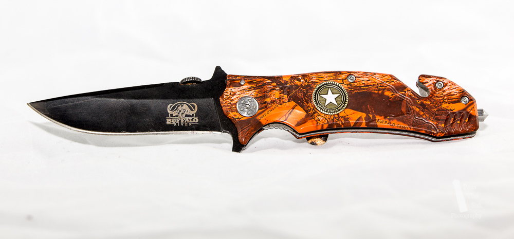
The above image of the knife is exactly what I mean. It shows the product in great detail and in high clarity but overall it’s a boring photo.
That being said there is a time and place for such a photo.
Product photography does not have a one-size-fits-all approach to photos. You can use many different techniques depending on the situation.
This photo above would look great in a catalog or auction site where a clean, clear image of the product for sale is required. People will see what it is and know exactly what they will get.
You see the flames?
For Me it’s Always Like This. (Brownie Points if you got that reference.)
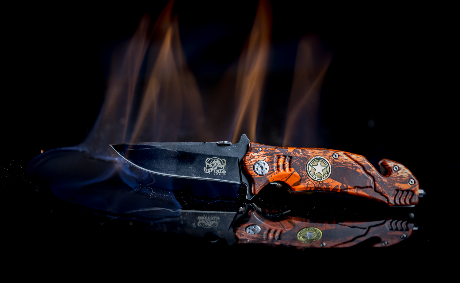
Here is the same knife but with more of a creative presentation.
My personal style is to use a lot of real flames to add a new and interesting element to the product.
It being of a natural and organic nature; the results are varied and experimentation is key to success.
A shot like this is usually the result of 30 images or more playing with the amount of fire and where it is applied.
We also have a reflection of the product in the lower side of the frame which also adds to the overall image and is commonly desired in product photography.
The reflection helps fill in dead space and add vibrancy to the otherwise blank area.
This is especially the case when the image won’t have text over the top of it or just a small amount. Text can help fill in blank areas that otherwise would drain life out of a photo and make it feel like it is missing something.
Scene Dressing
Another technique I enjoy is scene dressing or creating a set.
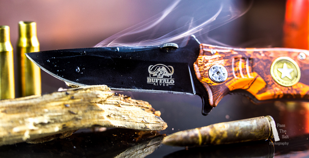
The image above is an example of this.
The knife is primarily targeted at hunters with it’s woodland camo design and army motifs so I tried to search for things that fit to that theme.
Spent ammunition casings and small bits of tinder helped make a scene you would find this knife in.
I could have even taken the knife outside and dressed a scene there.
I love this type of product shot as it is only limited to your imagination, of course finding the resources to create that mental image is the biggest limiting factor.
If the budget is big enough however, anything is possible. One notable example is Renault jumping it’s latest truck over a formula one car.
Since most of you here will be looking to do things on a much smaller budget than an international automobile manufacturer, we will keep our ambitions slightly more grounded however.
If you notice I also added smoke to this image.
This is another organic element which requires playing and testing to get great results. With this smoke I wanted it to curl around the blade and feel part of the product.
Getting this result involved a lot of arm flailing and flapping to move the air how I wanted it.
With no one seeing me flapping around like a chicken, my dignity was saved.
Creative shots like this work well in magazines or website adverts where they show in banners or borders of the site.
The product image needs to be catchy enough to distract the viewer from the content of the site and look at the product. If done correctly you can sell anything.
Don’t Just Stand There, Get Selling!
If you are here and have a product to sell then the next step is to get your product out there and sell it!
In today’s world you can get your product out in more ways than ever before.
Advertising space is able to be purchased on just about anything or anywhere and on any networking device.
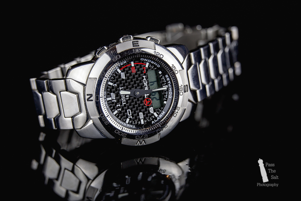
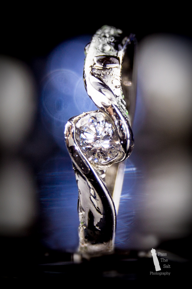
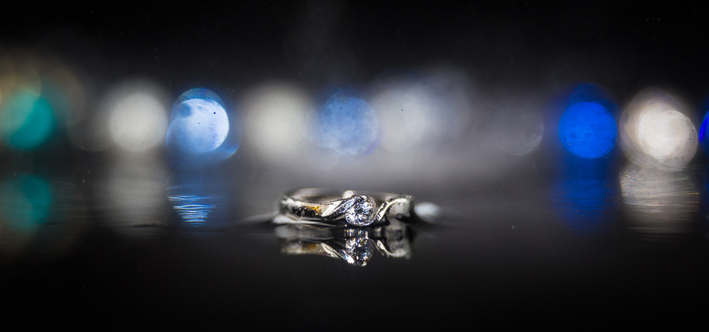
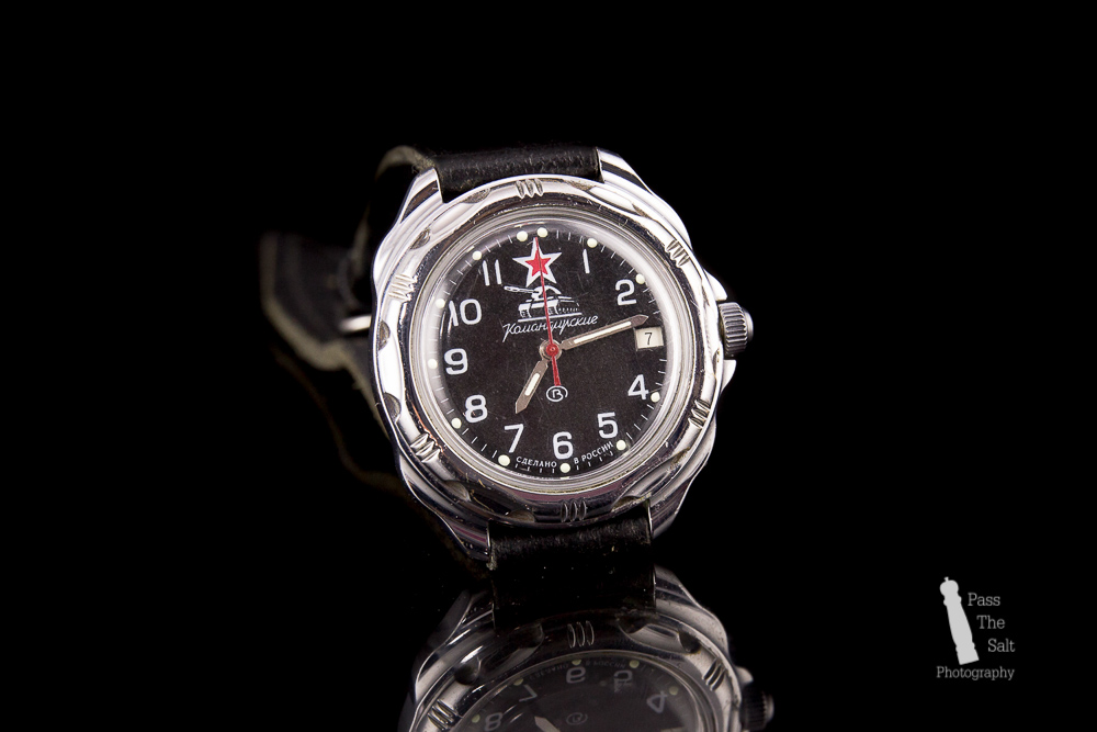
I can help provide you with those images that will be seen anywhere you advertise them. From clean product only shots to creative images that add demension to your product, I will be happy to help.
Take a look below at more examples of my work or get in touch and let me know what you have in mind.
